Last month we began color harmonies with complementary colors. This month, we will be exploring split complementary colors for our blocks. Split complementary colors are a group of three colors on a 12-color color wheel. Split complementary colors are one base color and then the two colors on either side of it’s complement color.
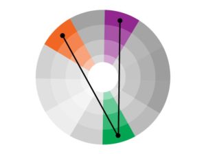
Split complementary color harmonies have the same strong visual contrast as complementary harmonies, but by choosing the adjacent colors from the base color, there is less tension. In this sample scheme we are showing green as the base color and the two colors adjacent to red, red-violet and red-orange. There are 12 combinations of split complementary colors you can create from the 12-color color wheel.
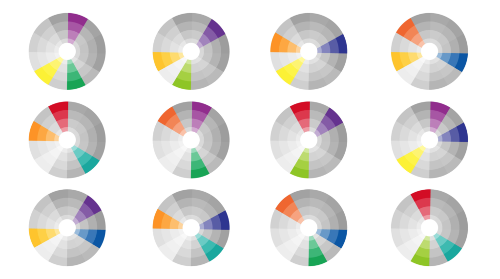
YOUR SPLIT COMPLEMENTARY COLORS BLOCK
You should select one split complementary color pairing for your block and then add additional shades or tints to finish the block. This block will be strong visually but will also be more comfortable visually because the colors will not fight for dominance in the same way that complementary colors do.
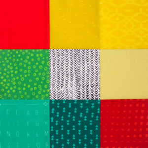
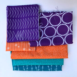
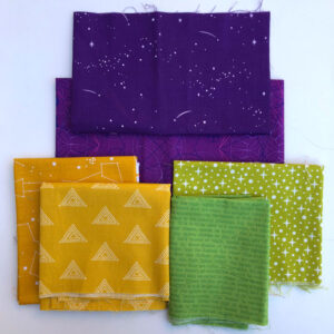
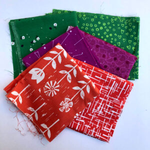
After selecting the split complementary color pair you will use, choose your fabrics and apply them to your block. Create a scrappier block by selecting more fabrics, or just use three fabrics to show the color harmony. This color study is a chance for you to explore and make something you love, there’s no right or wrong way!
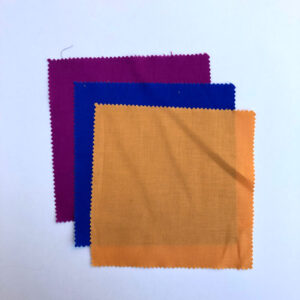
Keep in mind that different values will help make your block more or less harmonious. Don’t forget to share your blocks with hashtag #bouldermqgcolorstudy19.
