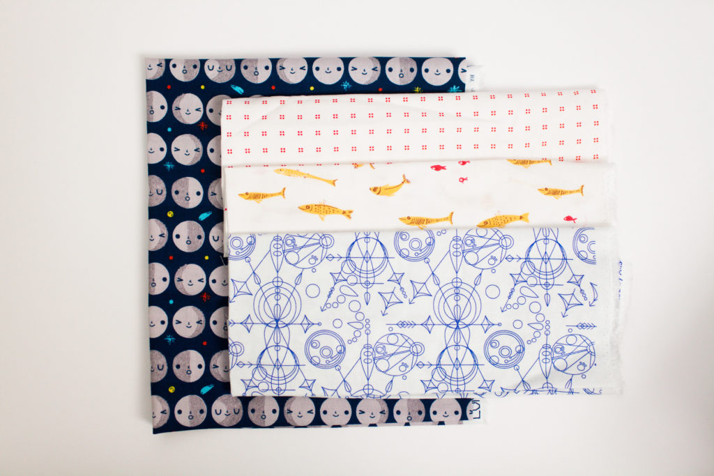
For our final color study we are going to look at neutral colors. This color group may have a lot of variations between individuals. The easiest way to describe neutral colors is that they are colorless, or they do not show up on the color wheel. You can create a more dynamic neutral scheme by selecting colors with high contrast between each other.
Neutral colors consist mainly of whites, blacks, grays, tans, browns, and beiges. Another way people refer to neutrals is by calling them “Earthtones”.
YOUR NEUTRAL COLORS BLOCK
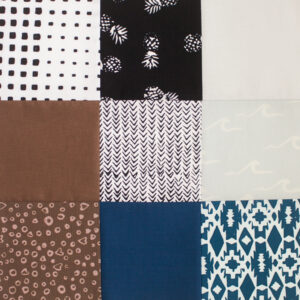
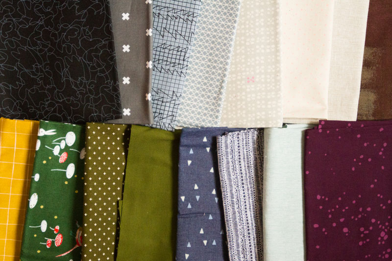
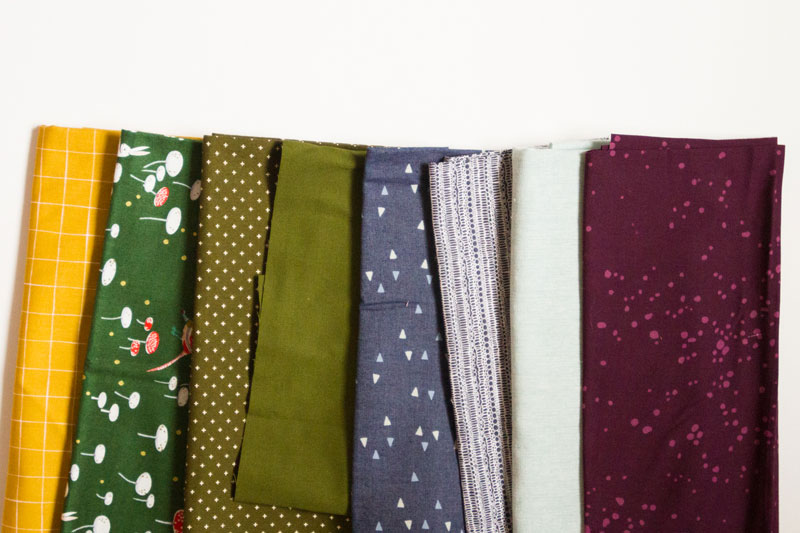
Select several neutrals for your block. Add more interest to your block by picking a range of values when choosing your fabrics. Remember, most of your neutrals won’t appear on the color wheel at all.
Our sample block features White, Black, Gray, Brown, and Navy.
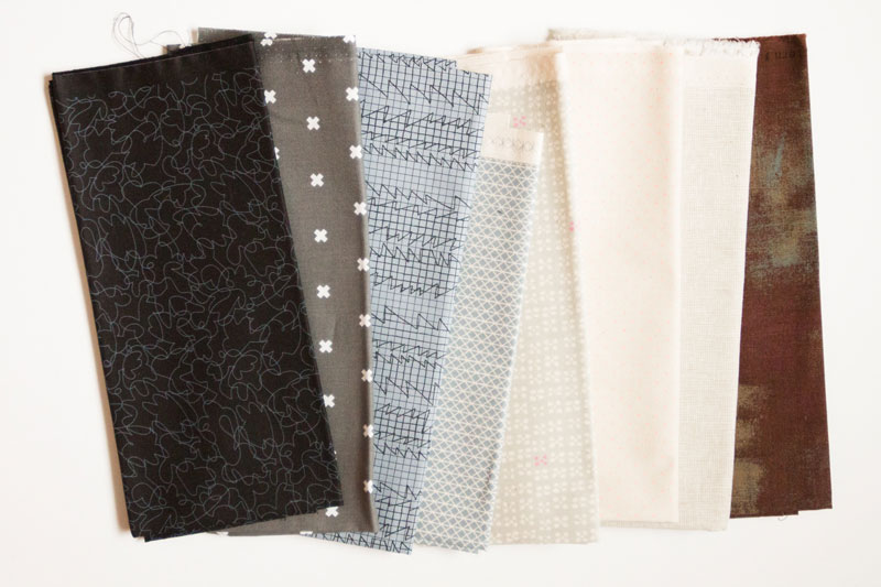
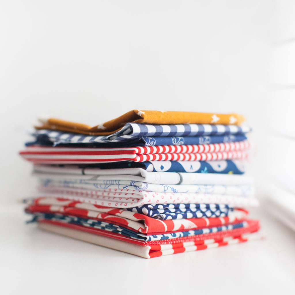
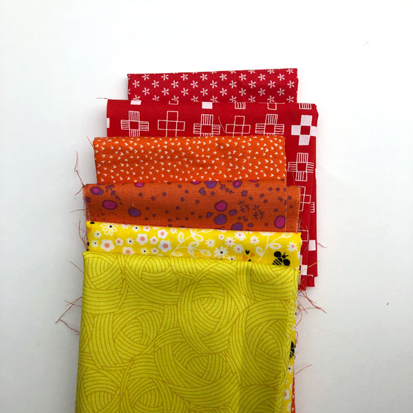
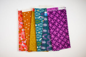
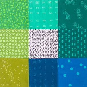
As with all the other color schemes, neutral colors can be personally influenced. If there is a color that you always feel reads as a neutral then you might choose to include it in your neutral scheme. You can see we included Navy Blue in our sample. Other colors that might work as neutrals may include olive green, gold/caramel, or even pale blue or yellow. Neutral colors also may appear more or less neutral based on the other fabrics used nearby. Below you will find some fabrics that would work well in a neutral color scheme.
Once you finish your final color study block you get to decide how to assemble your quilt. Please visit the color study introduction post HEREor read about different ways to assemble sampler quilts in the post HERE. Don’t forget to share what you make with hashtag #bouldermqgcolorstudy19.
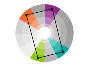
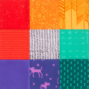
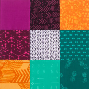
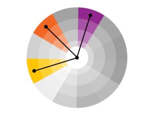
The color harmony this month is Tetradic Colors. Tetradic color schemes feature two complementary color schemes forming a rectangle. Tetradic color schemes are equally distributed around the color wheel and don’t feature a dominate color.
Our sample scheme features red-orange, yellow-green, blue-green, and red-violet.
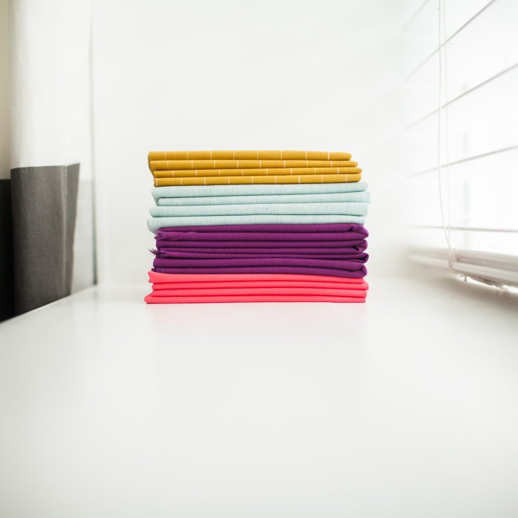
YOUR TETRADIC COLORS BLOCK
Choose 4 colors for your tetradic color harmony block. You may prefer to choose one color to feature most prominently, paying special attention to the balance of warm and cool colors.
The sample block features red-orange, yellow-orange, blue-violet, and blue-green.
The look of your block will vary greatly depending on if you choose a scheme with primary colors or one that features mostly secondary colors.
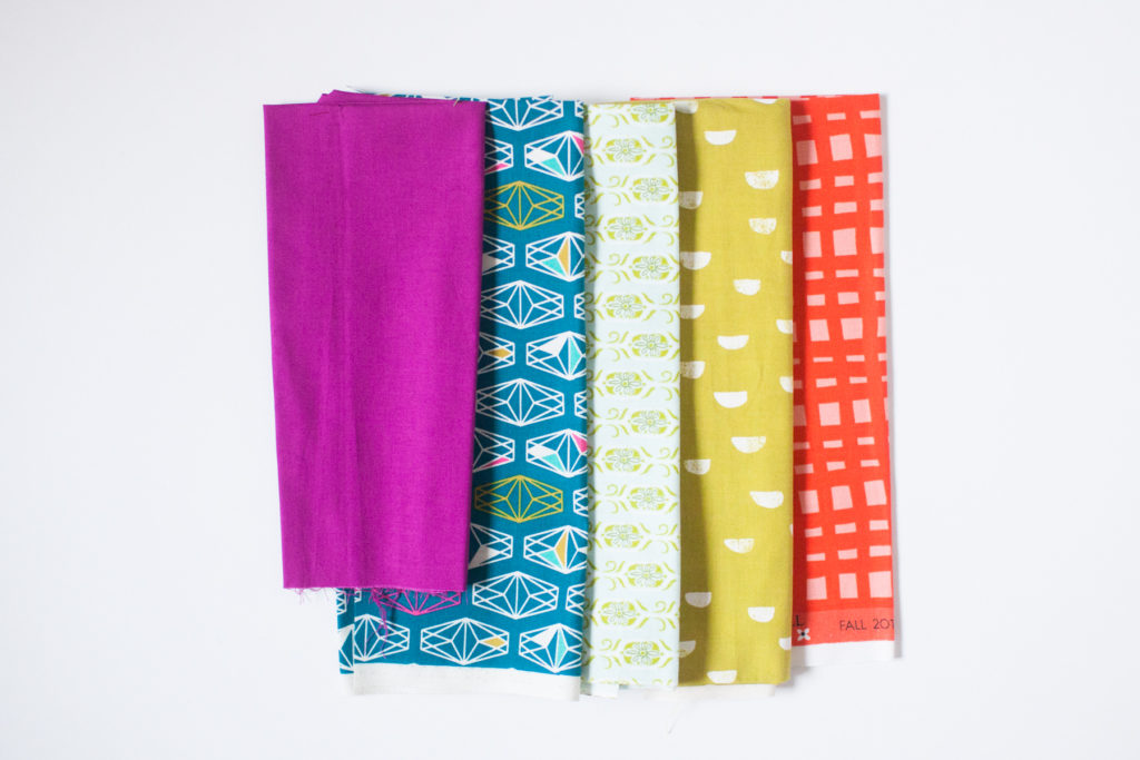
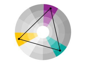
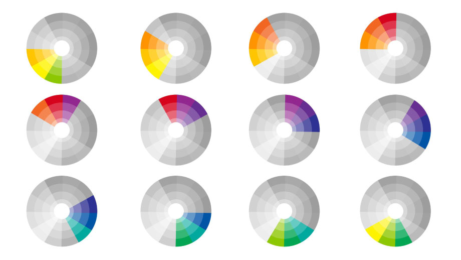
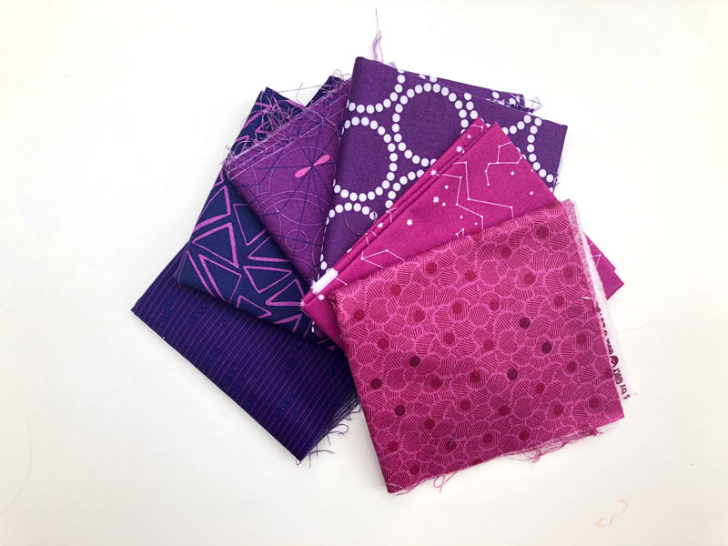
The color harmony this month is Triadic Colors. A triadic color scheme simply means a group of three colors evenly spaced on the color wheel. The most basic triadic schemes are Primary colors; red, yellow, blue, and Secondary colors; orange, green, violet. If you want to create a more dynamic triadic scheme you can select tertiary colors to create your group.
Our sample scheme consists of Yellow-Orange, Red-Violet, and Blue-Green. We chose to use tertiary colors to keep the scheme soft and flowing. If you prefer to select primary or secondary colors, you can. This may create a more vibrant scheme that visually vibrates as the colors compete for dominance.
YOUR TRIADIC COLORS BLOCK
Select 3 colors for your triadic color harmony block. You can add more depth to your block by using a variety of values of your triadic color scheme. Remember, your colors should be evenly spaced around the color wheel.
Our sample block features Yellow-Orange, Blue-Green, and Red-Violet.
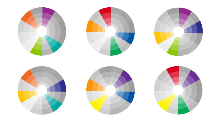
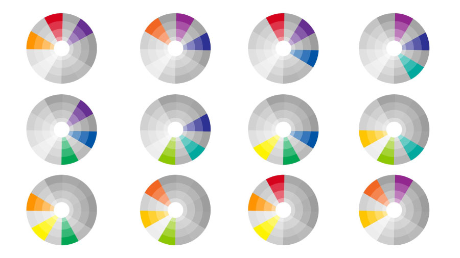
As we have stated in the past, color is mostly about personal preference. If you just love the primary or secondary colors then stick with those for you triadic scheme. Choosing a tertiary scheme only works if you like those colors. Here are some sample triadic color schemes.
Stitch up your Triadic Colors block. We can’t wait to see what you make; share them with hashtag #bouldermqgcolorstudy19.
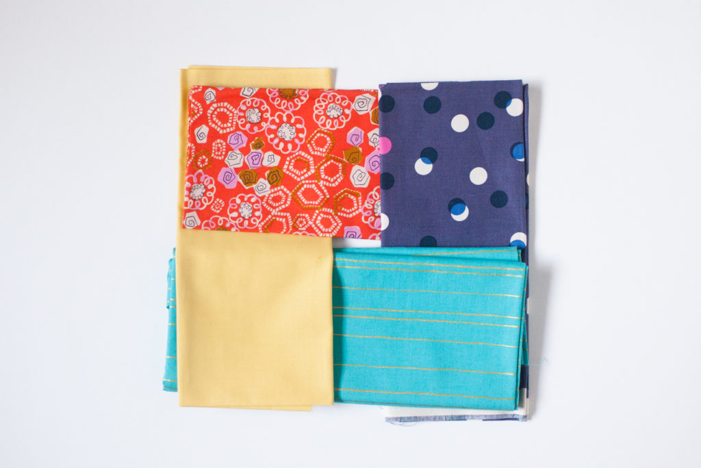
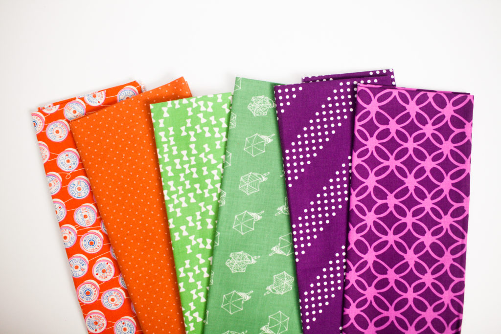
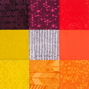
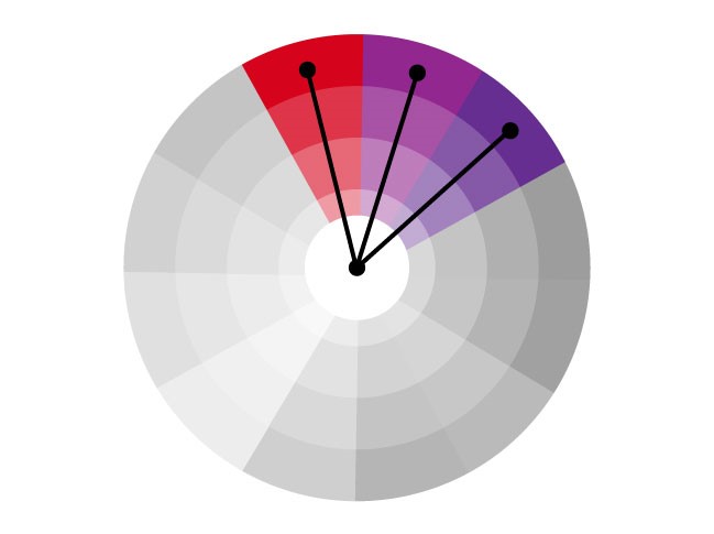
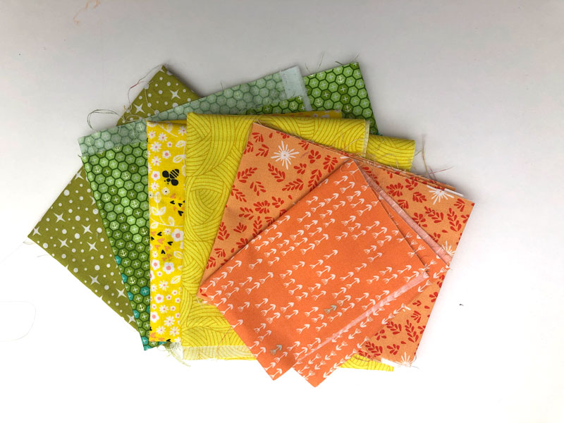
The next color harmony we are looking at is Split Analogous colors. To make a split analogous color scheme, you skip the colors in between an analogous color scheme. You will be selecting split analogous colors this month to create your block.
This split analogous theme is red-violet, red-orange, and yellow-orange and it skips red and orange between them. Unlike the regular analogous color scheme which usually consists of one primary, one secondary, and one tertiary color, a split analogous scheme can be all tertiary colors or a combination of primary and secondary. Split analogous color schemes are more vibrant and contrasting than an analogous color scheme.
YOUR SPLIT ANALOGOUS COLORS BLOCK
You should select a split analogous color scheme of 3 colors to use for your block. Unlike the August analogous block which featured warm or cool colors that stayed within the same color family, the split analogous color scheme might have more variation. Some of the split analogous color schemes do stay within cool or warm color families, but others will deviate from them.
Our sample block features Yellow-Orange, Red-Orange, and Red-Violet
You can add more depth to your block by using different values of split analogous colors. As with all the schemes we’ve been exploring this year, it’s all personal preference.
Choose your split analogous colors and select your fabrics. Once you’ve applied your choices to your blocks share them with hashtag #bouldermqgcolorstudy19.
The September evening meeting will be held at our new location:
Thursday, September 5 from 6 pm – 8:30 pm
Sister Carmen Community Center 655 Aspen Ridge Drive Lafayette, CO 80026
We will be conducting our annual membership survey at our September evening meeting. Please come with your ideas and requests for 2020 guild events, activities, and education programs. Following the business meeting we will be serving snacks, playing games, and giving out some great PRIZES!!! There are some additional ways you can earn a chance to win a prize; make and wear your quilty name tag (see the blog post here), bring in swap items for the free “garage sale” table, and consider what purse/bag you carry for our quilty edition of “Let’s Make a Deal-ish”.
OTHER ANNOUNCEMENTS
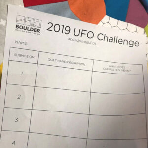
UFO
In August we pulled the next number for the UFO Challenge. Please be working on UFO #6, due at the October evening meeting. Share with #bouldermqgufos or email photos of finished projects before the October meeting.
QUILT SHOW
The deadline for the Negative Space quilt show has been extended and we will be accepting submissions until the website link is removed in the first week of September. If you have not submitted yet GO HERE.
COLOR STUDY
Don’t forget to keep sewing along with the color study quilt. Monthly blog posts are available HERE. You can catch up at any time. Tag your posts #bouldermqgcolorstudy19
POSTCARDS
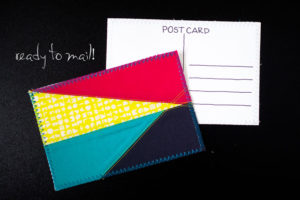
Please make sure you have mailed your postcards to anyone you received cards from. If you did not get any cards in the mail please contact Laura L. for more information. Also, please email or post on Instagram photos of the postcards you received and sent!
KONA CHALLENGE
If you are participating in the Kona COTY mini quilt challenge, please make sure you are working on a quilt 36” or smaller. We will share these quilts at the October open sew.
OPEN SEW
The next open sew will be Saturday, September 21, 9am-4pm. We will be sewing at our new location, Sister Carmen Community Center, 655 Aspen Ridge Drive, Lafayette. Our QuiltCon Charity Quilt Committee will lead us in sewing letters for our charity quilt entry. If you plan to attend, please RSVP.
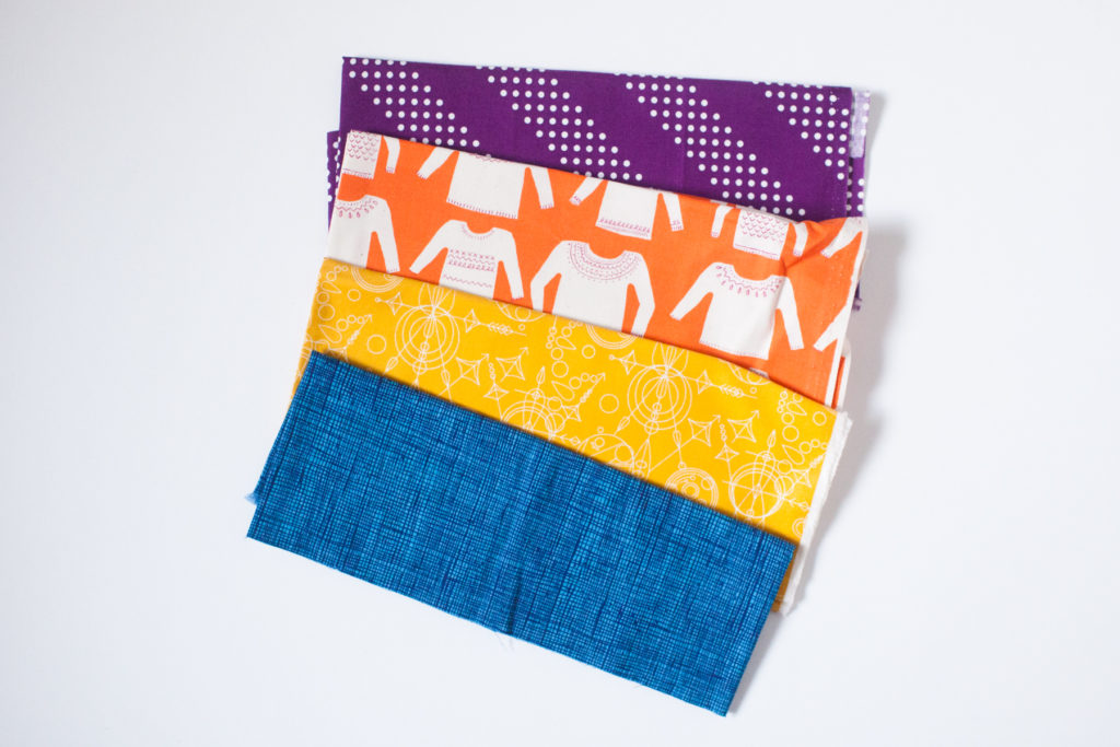
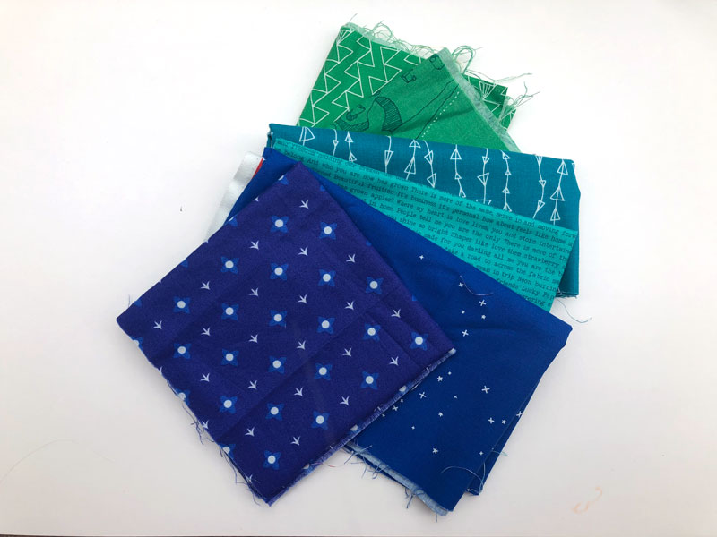
The next color harmony we are looking at is Analogous colors. Analogous colors are colors that sit directly adjacent to each other on the color wheel. Typically an analogous color scheme is made up of 3 colors. You will be selecting analogous colors this month to create your block.
An analogous color scheme is usually made up of one primary, one secondary, and one tertiary color. Our sample scheme consists of Red (primary), Red-Violet (tertiary), and Violet (secondary). Analogous schemes tend to be less vibrant than complementary schemes because of the reduced contrast between colors in the color group. The term analogous means there is a common color in the scheme that links the 3 colors.
YOUR ANALOGOUS COLORS BLOCK
You should select 3-4 adjacent colors on the color wheel to feature in your block. Keep in mind that the most pleasing analogous schemes stick to either all warm or cool colors. Your block will have a monochromatic feel to it because all the colors share a common color link.
Our sample block features Yellow-Green, Green, Blue-Green, and Blue.
You can add more depth to your block by using different values of analogous colors. Or keep it simple and just share the 3-4 colors illustrated by your fabrics selected. It’s really all personal preference, just as all the other schemes we’ve looked at the past several months.
Choose your analogous colors and select your fabrics. Once you’ve applied your choices to your blocks share them with hashtag #bouldermqgcolorstudy19.