By now you should have selected the block you will be making each month for your 2019 BoulderMQG Color Study Block of the Month Quilt. Every month we will provide you a new prompt for selecting fabric and colors for your block. Please read our introduction post for more details about selecting your block.

Value is an important lesson to understand when it comes to color theory. Value is the amount of tint (lightness) or shade (darkness) a color has. When you use different valued fabrics in your quilt, you add dimension. Darker colors tend to recede, while lighter colors advance. Even when selecting different colors you should look for different values. When the colors are all the same value they will fight for dominance and make your quilt appear flat.
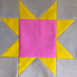
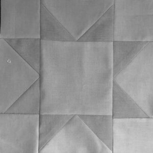
In this sawtooth star block you can see that the color photo on the left shows 3 colors. However, when viewing the black and white photograph on the right there is very little difference between the values of the 3 fabrics.
YOUR VALUE BLOCK
Your block can be created using neutrals or grayscale, monochromatic color selection, or multiple colors of fabric. The key to illustrating value within your quilt block is getting the fabrics in order of lightest to darkest. Value is determined only by comparing another value; whether something is lighter or darker is relative to the surrounding values.
When selecting your fabrics for this block, you will probably select some, if not all, fabrics outside of you preselected 12-color color wheel of hues. You are welcome to use only fabrics from those 12, but they will most likely not be in classic rainbow order.
DETERMINING VALUE OF YOUR SELECTED FABRICS
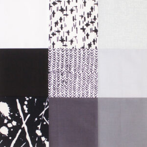
Our sample block was made with a grayscale of fabrics, starting with white as the lightest moving clockwise and ending with black as the darkest.
You will need to pick at least 3 fabrics to illustrate value. The simplest example being white, gray, and black. Once you select the fabrics for your January Value block, you need to determine the order of value. If you are using neutrals, particularly grays, you can arrange your fabrics from light to dark (or dark to light) fairly easily just by eye. It can be helpful to take a photograph of the fabrics or to check them in different lighting conditions in order to confirm your arrangement. If you choose to use fabrics with colors, whether prints or solids, there are some helpful tips when determining value order.
The most accurate method to check the value of your fabrics is to take a photograph and remove the color information by turning it black and white. You are then only looking at the tints and shades and no longer looking at the colors of the fabrics. There are many basic editing apps you can get on your phone that will allow you to change a color photo into black and white. Once you have removed the colors, you will be able to clearly identify the order of values.
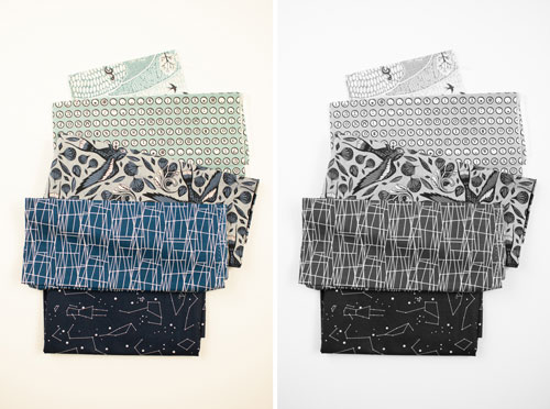
Not only does the main background color of a print fabric determine its value, but also the color(s) used in the pattern and the density of the print. For example, the second fabric from the top has fairly dense white circles which makes it appear as a lighter value than the third fabric featuring darker birds. Even though the main background colors of these fabrics have the same value, you can use the prints to help determine an overall value order of the group.
You can easily make your picture black and white in your phone photo app. Here we show how to make your photo black and white just using your iPhone.

Step 1: Select Edit in your Photos app.
Step 2: Select the dial from the lower menu.
Step 3: Select Color from the dial menu.
Step 4: Slide the saturation all the way to the left to remove all color. Select done to save your black and white photo.
For a quick check without needing to use a camera and then editing your photo, you can use a red value finder to view your fabrics. There are some commercially made red value finders available on the market, or you could make your own with transparency paper or acrylic. Red is used for value finding because the red hue cancels out color information and reveals the tint or shade. You can then arrange your fabrics in the correct value order.
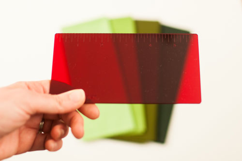
Although it is fairly easy to see the value differences in this group of solid green fabrics, this technique can be applied to other fabric pulls.
The red value finder is a “quick check” tool that you can just hold up on the spot. However, there are some errors in using a red value finder; particularly with warm colors. When viewing warm colors you could opt to use a green value finder for more accurate results.
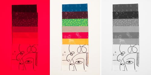
In this example you can see that the red value finder on the left does not correctly order the warm colors (red-violet, magenta, yellow) when compared to checking the value with the black and white photo on the right.
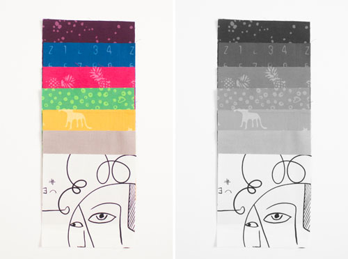
Instead, the correct value is illustrated by only using the black and white photo technique.
After determining your value order, apply this to the block you have selected for your Color Study Quilt. Remember, the lesson for January is value, so your block should showcase an order of 3+ fabrics from light to dark, or dark to light. Share your makes using the hashtag #bouldermqgcolorstudy19.
