By Karla Haynes
Every month for the rest of the year we will be doing a fabric selection challenge based on a preselected theme. To play along, you just need to pull a selection of fabrics from your stash and post a photo using the hashtag #bouldermqgfabricpull – you don’t even need to make anything (but you might want to)!
For the month of April, the theme is “spring pastels.” The interpretation of “pastel” is definitely a little loose in this post, since my stash is pastel challenged.
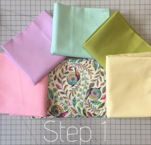
This month I would like to walk you through my fabric selection process step-by-step. This isn’t the last word on fabric pulls (there are so many ways to do this!), but it works for me. For this pull, I’ve once again chosen a centerpiece fabric to serve and an anchor to bring all the colors together. This month, it is Tula Pink’s Slow and Steady Pit Crew Snails.
If you know me, you know I rarely use solids in my quilting and I generally jump in to my fabric pulls without a stop in solidsville. However, solids do not distract the eye in the process of color matching, so I’ve use them here as an approachable path to pattern matching. It also helps that most of my pastels in my stash are in the form of solids!
Step 1:
The first thing I do is isolate the color scheme used in the main fabric. This is a really effective way to create a color story in your quilt – most fabric designers use color in a very intentional way. If the fabric speaks to you with a certain voice, there’s a good chance that a fabric pull with coordinating colors will also have a story to tell. If you will be adding fabrics to this pull after the first step, you can choose colors that all have roughly the same value, since you will be adding depth in the next steps. However, if you are going to stop after step 1, you would want to make sure that your coordinating fabrics all have varying values so that your quilt does not appear flat.
Step 2:
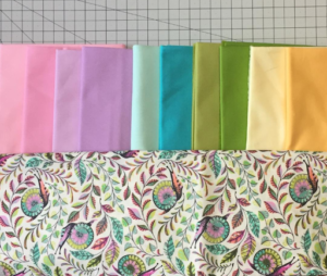
Select a fabric that has a value darker or lighter for each of your coordinating fabrics to add to the mix. It doesn’t matter if this color is represented in the original fabric or not because your color choices are anchored to your main fabric by your initial pull. Notice how bringing in a shade darker for each hue has made it possible to see the shading and depth in the centerpiece fabric, it really brings it to life when you compare it to the pull that has a more flat value in step 1.
Step 3:
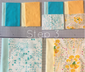
Now it’s time to add prints! Replace your second solid with a print that contains the same tint/shade that you’ve added in step 2 (darker or lighter than your first selection in each hue). Replacing with the low volume prints of the same value have changed the character of the pull and given it more of an overall pastel feeling. Note: for most of my pulls, I eliminate step 1 & 2 and move straight on to step 3 and pull prints without stopping by any solids.
Step 4:
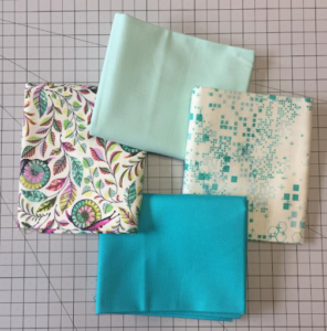
(Optional) You can test out your fabrics one color range at a time to see if you like how they play together. Again, you could use this smaller pull for a block or a full quilt if this speaks to you.
Step 5:
Audition your fabric pull together to see if you are happy with it once you’ve finished your color-focused mini-pulls! This is where you might change out a color that stands out as not belonging in the quilt. If I had a lighter one on hand or wanted to purchase fabric, I might reduce the brightness of the Kona green and look for a more blue-purple Kona. However, I’m pretty happy with this as it is!
We’d love to see your fabric pulls! Make sure you’re sharing them on Instagram using #bouldermqgfabricpull
