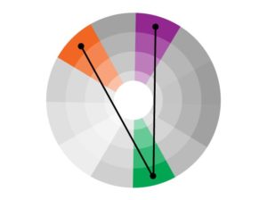
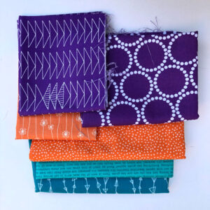
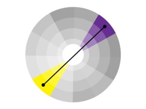
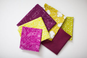
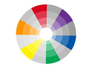
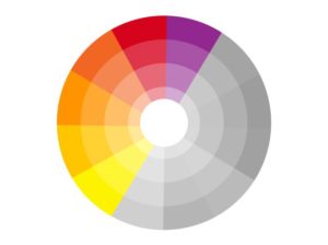
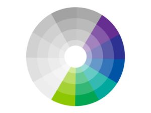
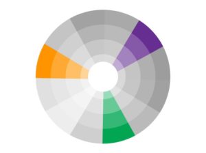
Last month we began color harmonies with complementary colors. This month, we will be exploring split complementary colors for our blocks. Split complementary colors are a group of three colors on a 12-color color wheel. Split complementary colors are one base color and then the two colors on either side of it’s complement color.
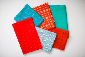
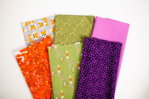
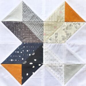
Split complementary color harmonies have the same strong visual contrast as complementary harmonies, but by choosing the adjacent colors from the base color, there is less tension. In this sample scheme we are showing green as the base color and the two colors adjacent to red, red-violet and red-orange. There are 12 combinations of split complementary colors you can create from the 12-color color wheel.
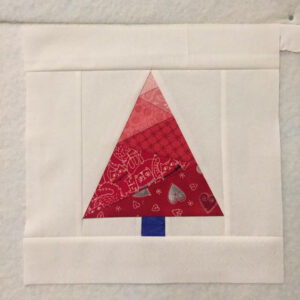
YOUR SPLIT COMPLEMENTARY COLORS BLOCK
You should select one split complementary color pairing for your block and then add additional shades or tints to finish the block. This block will be strong visually but will also be more comfortable visually because the colors will not fight for dominance in the same way that complementary colors do.
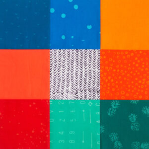
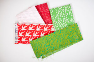
After selecting the split complementary color pair you will use, choose your fabrics and apply them to your block. Create a scrappier block by selecting more fabrics, or just use three fabrics to show the color harmony. This color study is a chance for you to explore and make something you love, there’s no right or wrong way!
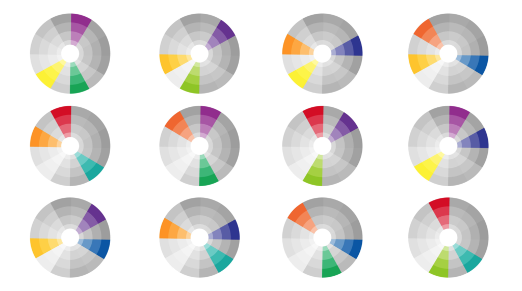
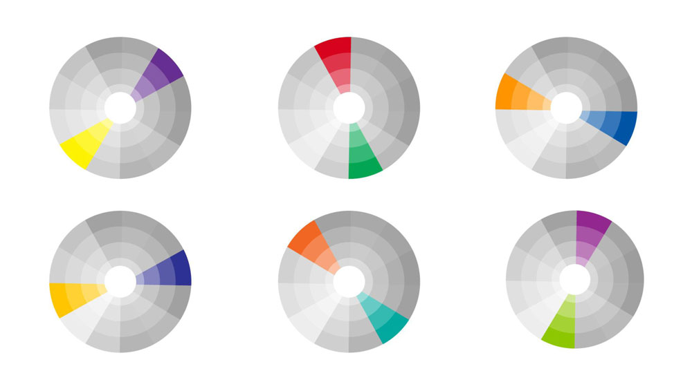
Orange, Blue-Violet, and Blue-Green
Violet, Yellow-Orange, and Yellow-Green
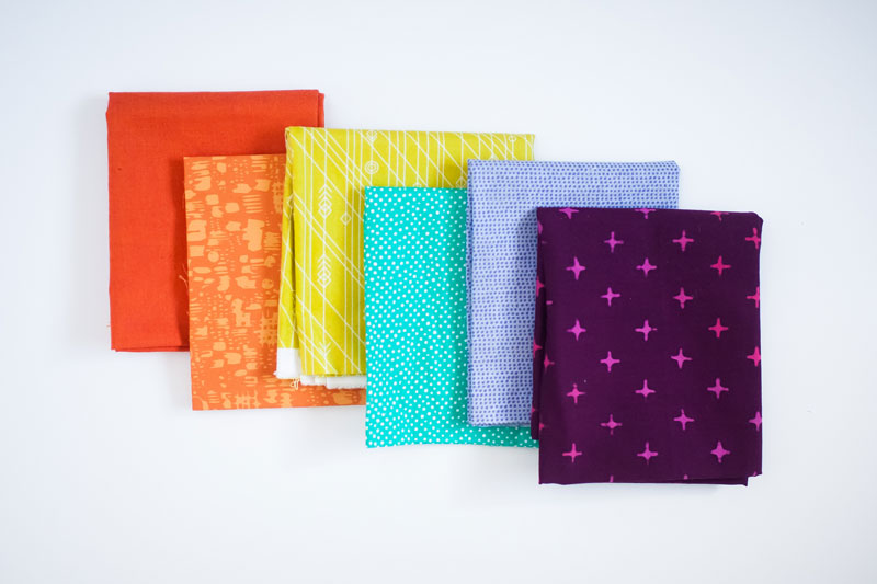
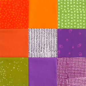
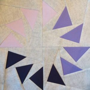
Green, Red-Orange, and Red-Violet
Orange, Red-Violet, and Blue-Violet
Keep in mind that different values will help make your block more or less harmonious. Don’t forget to share your blocks with hashtag #bouldermqgcolorstudy19.
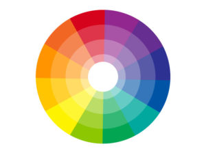
We are now going to start our studies on color harmony. Color harmony is when you use combinations of colors to create orderly and pleasing arrangements. These arrangements should have congruity and balance; the harmony should engage the viewer. There are many types of color harmonies. The most basic consists of two colors; complementary colors. Complementary colors are two colors that are directly across from each other on the 12-color color wheel. You will be selecting complementary colors this month to create your block.
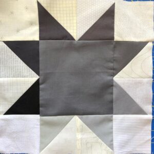
In this sample scheme we are showing violet and it’s complementary color, yellow. These two colors are directly across from each other on the color wheel. Complementary colors are always primary + secondary colors, or two tertiary colors. There are 6 combinations of complementary colors you can create from the 12-color color wheel. The primary + secondary pairings; Yellow + Violet, Red + Green, Orange + Blue. And the tertiary pairings; Yellow-orange + Blue-violet, Red-orange + Blue-green, and Yellow-green + Red-violet.
YOUR COMPLEMENTARY COLORS BLOCK
You should select one or two complementary color pairings to feature in your block. Complementary colors will fight for dominance within a color scheme and can create a vibrating effect. You can avoid this by selecting different values of the colors. This will allow one color to advance and one to recede creating a more harmonious color scheme.
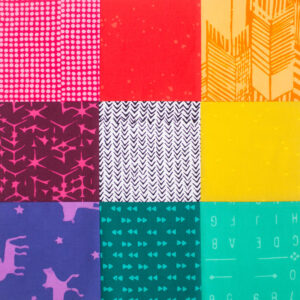
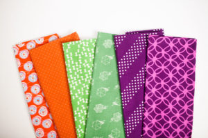
Our sample block features both Orange + Blue and Red-Orange + Blue-green.
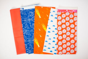
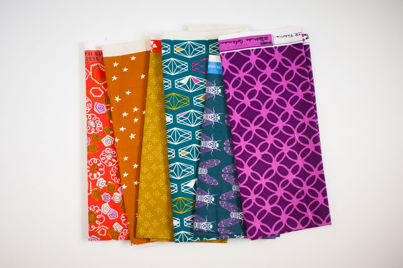
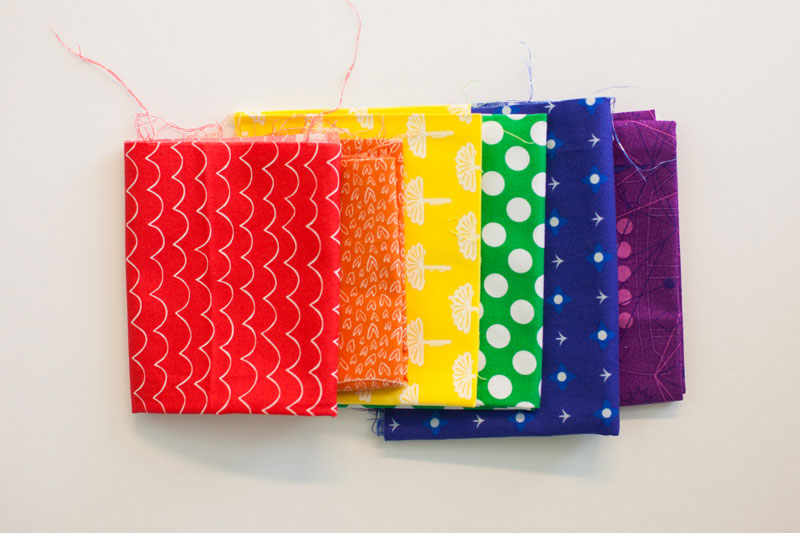
You can use just two fabrics to illustrate the complementary color harmony, or you can select tints and shades or a variety of prints to convey the pairing you picked. As we keep saying, color is mostly about personal preference. If you like a more scrappy looking quilt block, you might do better showing two pairings using multiple tints, shades, or prints of each color you have selected. Here are some fabric pulls showing how you could choose complementary fabrics for your block.
After selecting the complementary color pair(s) you will use, choose your fabrics and apply them to your block. Keep in mind that different values will help make your block more or less harmonious. Don’t forget to share your blocks with hashtag #bouldermqgcolorstudy19.
Once you have established the six color rainbow, you can then use the adjacent primary + secondary colors to create tertiary colors. The six tertiary colors can be added to the six rainbow colors [primary and secondary colors] to make the 12 color wheel.
For your block this month, you will want to focus on only the six tertiary colors; red-orange, yellow-orange, yellow-green, blue-green, blue-violet, and red-violet.
YOUR TERTIARY COLORS BLOCK
Again, you have only six tertiary colors to work with on a block that may have more than six changeable components. You can select multiple prints of the same color or you can add in different values of some of the colors.
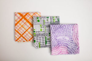
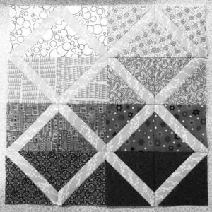
The sample block uses two prints in different values of each of two tertiary colors; Blue-Green, and Red-Violet.
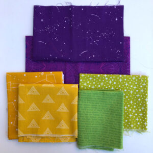
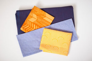
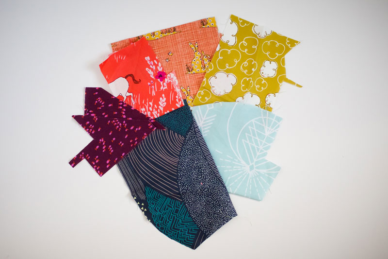
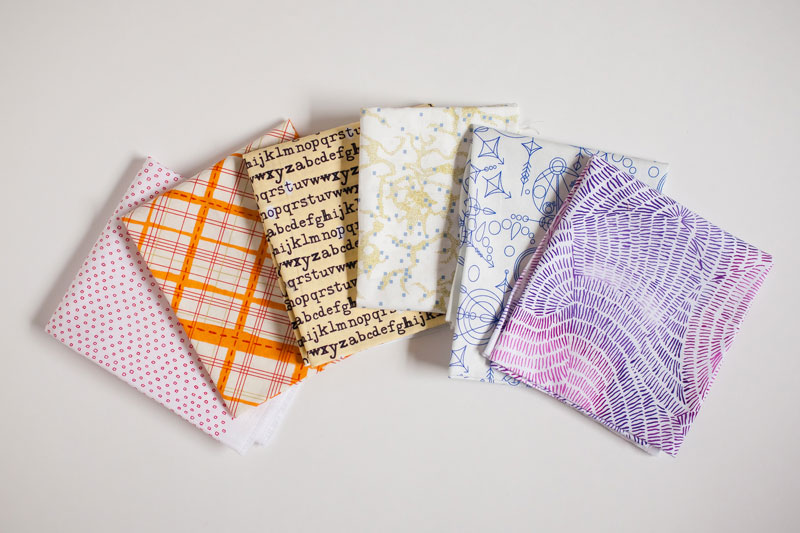
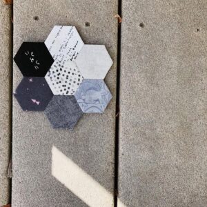
Tertiary colors can be fun to work with because there is a lot of flexibility in the actual hues. If you tend to like warm colors then you can select blue-green and leans more towards green and red-violet that tends closer to red. This block is where you can start really making a mark with your personal color preferences. As seen in our sample block, magenta was used as a value of red-violet. Let yourself go a little crazy with your fabric pulls this month, but try to remember to really illustrate the tertiary colors; red-orange, yellow-orange, yellow-green, blue-green, blue-violet, and red-violet. Here are a few more fabric pulls that would work well for a tertiary block.
Get your tertiary fabrics in order and assemble your block. We can’t wait to see what you come up with. Please share with us using the hashtag #bouldermqgcolorstudy19.
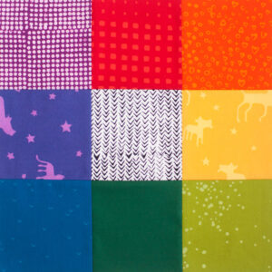
By combining the three primary colors and the three secondary colors we can form a basic rainbow of colors. You may remember your grade school lessons on ROY. G BIV. We will be focusing on just six of those seven basic colors. The six colors we will include in our rainbow are; Red, Orange, Yellow, Green, Blue, and Violet. When Isaac Newton came up with the color wheel he included Indigo, or blue-violet, only because he based it on seven intervals of a musical octave. Therefore, needing a seventh color.
We challenge you to create a block featuring the six basic rainbow colors; Red, Orange, Yellow, Green, Blue, and Violet. Try to stay away from adding in tertiary colors just to fill your changeable components. We will be focusing on tertiary colors in a future color study lesson.
YOUR SIX COLOR RAINBOW BLOCK
Once you select your fabrics to represent your six color rainbow, you can now have fun making your rainbow block. Individually each color may evoke a different emotion.
Starting with the warm colors; Red is commonly associated with love or aggression, Orange with confidence and friendliness, Yellow brings feelings of energy and happiness.
The cool colors also have different emotions associated with them. Green is often related to environment but also with envy, Blue is calming and trustworthy, while Violet is thought of as royal or mysterious. However, there is no denying that the six colors together creating a rainbow evoke feelings of playfulness and joy.
Our sample block does contain blue-violet (Indigo) and also features green in two different values. We chose to do this in order to have 8 different fabrics in the 8 changeable components of this block.
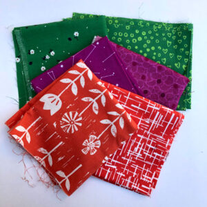
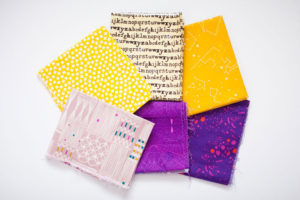
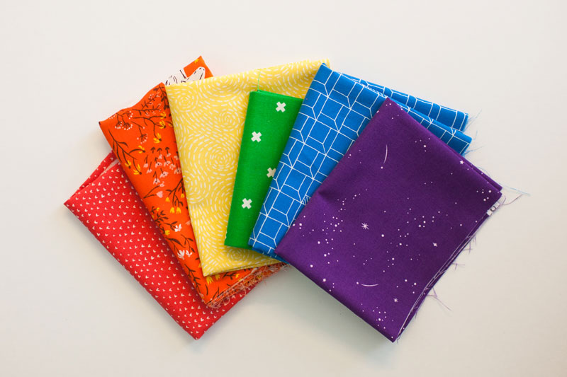
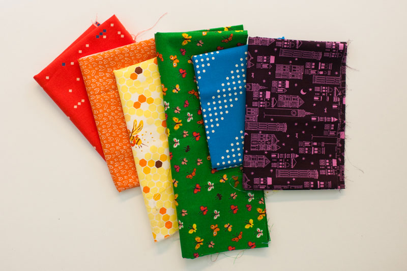
If you need to fill in your blocks changeable components you can venture into the land of Indigo, a tertiary color we will call blue-violet. Or you can use different values of the six basic colors. Make a block that brings a smile to your face. Use fabrics and colors that you love. Color will always be a personal opinion of liking what you like. Feel free to select tints or shades to make your block your own. Have fun when selecting the fabrics for your six color rainbow block. Here are just a few examples of fabrics you could use.
Your rainbow does not have to be super saturated brights as pictured. Choose the fabrics you love that illustrate a six color rainbow. Make sure to include at least one fabric for each of the six colors; Red, Orange, Yellow, Green, Blue, and Violet. Get your block sewn together and don’t forget to share using the hashtag #bouldermqgcolorstudy19.
For our March color study we will be looking at Secondary Colors; Orange, Green, and Violet. Secondary Colors are the colors made by mixing adjacent Primary Colors; Red + Yellow = Orange, Yellow + Blue = Green, Blue + Red = Violet.
YOUR SECONDARY COLORS BLOCK
You should apply the three secondary colors to your block in a balanced manner. Because we are still working with a block with more than three changeable components, you will again need to choose where to apply the fabrics of each color.
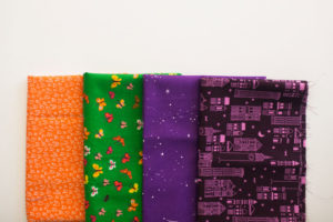
Our sample block contains a variety of prints and solids in different values of each color; Orange, Green, and Violet.
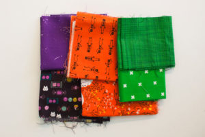
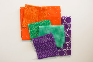
You can again use the same three fabrics to fill in the changeable components, or you can select multiple options of each of the secondary colors; Orange, Green, and Violet. By picking different values or prints of each color you have the opportunity to make your block more dimensional. Remember, color is very subjective and you should choose tints or shades of each color in a variety that is pleasing to you. Be careful not to venture into tertiary colors where the hue is not a true secondary color. Here are some examples of fabric selections that would work to make your color study block featuring secondary colors.
Don’t forget to include at least one fabric of each secondary color; Orange, Green, and Violet. Then, arrange your block in a way that you love! We want to see what you made. Share it using the hashtag #bouldermqgcolorstudy19.
Laura L. and Rebecca will be continuing their presentation on Color Theory. This month we will be focusing more on color harmonies and color schemes. If you have made a block for the 2019 Boulder MQG Color Study BOM, make sure you share it.
If you have a color wheel, please bring it. It will be useful for following along and some exercises we have planned.
This is also the first check in for the 2019 UFO Challenge.If you are taking part, make sure you bring your completed UFO. If you aren’t able to attend the meeting, you will need to either email a photo of the finished project or tag it on Instagram with #bouldermqgufosIf you don’t send a photo or tag it BEFORE the February 7 meeting, it will not be included in the drawing. We will also be choosing the next project, check your email for the number!
OTHER ANNOUNCEMENTS
The January color study prompt was Value, it’s great seeing the different blocks everyone picked out!